Transit Stops and Shelters
It can be challenging for people impacted by blindness to locate transit stops, as identification is often largely dependent upon elevated signage. Use guidance TWSIs, such as tactile strips, across sidewalks to assist in locating transit stops.
Bus stop layouts should be consistent, although the limitations of a location may cause variation to be necessary. Furniture or other amenities (e.g., waste receptacles and newspaper boxes) near transit stop marker poles should be cane detectable, of a visually contrasting colour, texture and located so as not to obstruct accessible use of the stop.
Transit stops should be located on an accessible route and have a marker pole that is identifiable, visually and tactilely, from other facilities and elements along the route. Stops should be identified with visual and tactile signage. In circumstances where neither bus shelters nor benches exist, poles and signage should be differentiated from similar structures.
Pedestrians with blindness should be able to identify a “bus stop” sign by touch or colour. Further information on accessible signs is provided in the Signage section. Stop identification numbers that are posted for real-time transit information should be in large-print, braille and raised numerals, located to be readable and touchable.
Boarding areas at transit stops should be firm, stable, slip resistant and directly connected to an accessible pedestrian pathway. They should be sloped no steeper than 1:50 in any direction, but never steeper than 1:20. When a boarding area is higher than 250 mm above the surface of the road, attention TWSIs should be installed along the unprotected edge. Further information can be found in the section on Tactile Walking Surface Indicators.
Where a transit stop is separated from the pedestrian access path by traffic lanes, the crossing route should be accessible and have APSs.
Shelters at transit stops are recommended to provide weather-protection for commuters. Doors into transit shelters should be accessible. Where no door is provided, a clear opening at least 920 mm wide should be provided. Further information can be found in the section on Exterior Doors. Where seating is provided within transit shelters, the seats should be colour contrasted to be identifiable for people impacted by blindness.
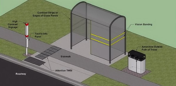
Bus shelters are typically designed to be mostly transparent, to allow bus drivers to see passengers inside them. As with glass doors and panels in other contexts (see sections Exterior Doors and Mirrors, Glazed Screens and Sidelights), the edges of all panels should be marked with a colour-contrasting strip and have contrasting stripes at eye level. Glass panels should extend as close to the ground as possible so that panels are cane detectable. Additionally, panels should be consistent in width from top to bottom to prevent overhead or tripping hazards.
Electronic signage at stops and stations, if not executed correctly, can present a challenge for individuals with blindness. Red LED signs are difficult to read, as are dynamic signs where text scrolls across a screen. Yellow on black is preferred for electronic signage, and if scrolling messages are necessary, they should move slowly enough to be read comfortably.