Kitchens
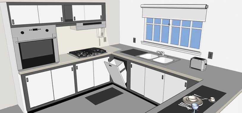
Kitchens and coffee stations should be made accessible for people impacted by blindness. The use of colour contrast can help people with low vision to locate surfaces, controls and appliances.
A dark counter works well when users of the kitchen need to identify light-coloured objects on it, such as white plates. For dark counters, use a light backsplash and choose dark cupboards with light-coloured drawer pulls and knobs.
Similarly, a light counter works well when a user will be identifying dark-coloured objects, such as dark plates. In this case, use a dark backsplash and choose light cupboards with dark drawer pulls and knobs.
Switches and wall outlets should also be colour contrasted to the surface they are mounted on.