Colour Contrast on Signs
The contrast between a signboard and its surrounding surface (e.g., an indoor wall or vegetation behind a freestanding sign outdoors) should be at least 50 per cent based on the formula described in the section Colour and Brightness Contrast. Characters and pictograms on signs should contrast in colour by at least 70 per cent to their background.
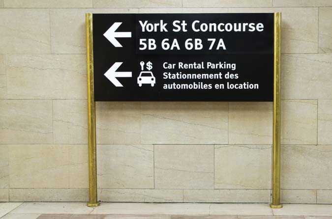
For people impacted by blindness, white lettering on a dark background is generally easier to read than dark lettering on a white background.
| Background surface | Sign background | Lettering colour |
|---|---|---|
| Light brick or light stone | Dark (black preferred) | White or yellow |
| Whitewashed wall | Dark (black preferred) | White or yellow |
| Red brick or dark stone | White | Black, dark green or dark blue |
| Green vegetation | White | Black, dark green or dark blue |